Sử dụng D3.js để xây dựng các biểu đồ và giao diện dữ liệu trên web là một bước thực hành quan trọng sau khi đã tìm hiểu các khái niệm cơ bản của thư viện này. Trong bài này, chúng ta sẽ đi qua nhiều ví dụ từ cơ bản đến nâng cao, bắt đầu với các biểu đồ phổ biến như bar chart, pie chart, histogram, boxplot, line chart và scatter plot, sau đó mở rộng sang các kỹ thuật tương tác như lọc dữ liệu, tooltip, animation và data binding.
Thông qua bài này, chúng ta sẽ biết cách sử dụng D3.js để:
- vẽ biểu đồ,
- kết hợp dữ liệu với giao diện,
- xây dựng các thành phần tương tác trong môi trường web.
Nhờ đó, chúng ta sẽ thấy rõ vì sao dùng D3.js là một lựa chọn rất hiệu quả khi xây dựng các ứng dụng trực quan hóa dữ liệu hiện đại.
Vẽ các biểu đồ cơ bản
Bar chart
<!DOCTYPE html>
<html>
<head>
<meta charset="utf-8">
<script src="https://d3js.org/d3.v7.min.js"></script>
</head>
<body>
<svg id="chart" width="600" height="400"></svg>
</body>
</html>
<script>
// ===== HÀM BAR =====
function bar(selector, data, options = {}) {
const {
width = 600,
height = 400,
color = "steelblue",
title = "Bar Chart",
xLabel = "X",
yLabel = "Y"
} = options;
const margin = { top: 50, right: 30, bottom: 50, left: 50 };
const innerWidth = width - margin.left - margin.right;
const innerHeight = height - margin.top - margin.bottom;
const svg = d3.select(selector)
.attr("width", width)
.attr("height", height)
.html("") // clear chart cũ
.append("g")
.attr("transform", `translate(${margin.left}, ${margin.top})`);
// scale
const x = d3.scaleBand()
.domain(data.map(d => d.name))
.range([0, innerWidth])
.padding(0.3);
const y = d3.scaleLinear()
.domain([0, d3.max(data, d => d.value)])
.nice()
.range([innerHeight, 0]);
// bars
svg.selectAll("rect")
.data(data)
.enter()
.append("rect")
.attr("x", d => x(d.name))
.attr("y", d => y(d.value))
.attr("width", x.bandwidth())
.attr("height", d => innerHeight - y(d.value))
.attr("fill", color);
// axis
svg.append("g")
.attr("transform", `translate(0, ${innerHeight})`)
.call(d3.axisBottom(x));
svg.append("g")
.call(d3.axisLeft(y));
// title
svg.append("text")
.attr("x", innerWidth / 2)
.attr("y", -20)
.attr("text-anchor", "middle")
.style("font-size", "18px")
.style("font-weight", "bold")
.text(title);
// x label
svg.append("text")
.attr("x", innerWidth / 2)
.attr("y", innerHeight + 40)
.attr("text-anchor", "middle")
.text(xLabel);
// y label
svg.append("text")
.attr("transform", "rotate(-90)")
.attr("x", -innerHeight / 2)
.attr("y", -40)
.attr("text-anchor", "middle")
.text(yLabel);
}// function bar
// ===== HÀM BAR =====
// ===== GỌI HÀM (GIỐNG MATPLOTLIB) =====
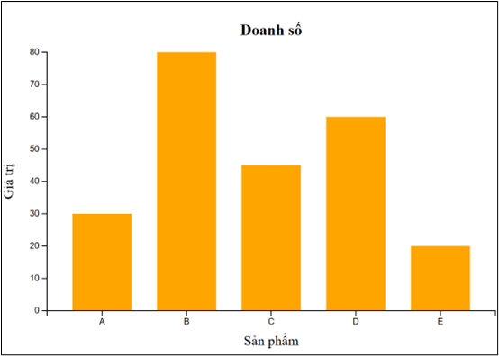
const data = [
{ name: "A", value: 30 },
{ name: "B", value: 80 },
{ name: "C", value: 45 },
{ name: "D", value: 60 },
{ name: "E", value: 20 }
];
bar("#chart", data, {
title: "Doanh số",
xLabel: "Sản phẩm",
yLabel: "Giá trị",
color: "orange"
});
</script>Ví dụ trên minh họa cách sử dụng D3.js để xây dựng biểu đồ cột từ dữ liệu dạng danh mục. Dữ liệu được ánh xạ sang vị trí và chiều cao thông qua scale, giúp chuyển đổi từ giá trị số sang không gian hiển thị trên màn hình.
Pie chart

<!DOCTYPE html>
<html>
<head>
  <meta charset="utf-8">
  <script src="https://d3js.org/d3.v7.min.js"></script>
</head>
<body>

<svg id="pie" width="500" height="400"></svg>

</body>
</html>

<script>
// ===== HÀM PIE =====
function pieChart(selector, data, options = {}) {
  const {
    width = 500,
    height = 400,
    title = "Pie Chart"
  } = options;

  const radius = Math.min(width, height) / 2 - 20;

  const svg = d3.select(selector)
    .attr("width", width)
    .attr("height", height)
    .html("")
    .append("g")
    .attr("transform", `translate(${width / 2}, ${height / 2})`);

  // ===== COLOR =====
  const color = d3.scaleOrdinal(d3.schemeCategory10);

  // ===== PIE =====
  const pie = d3.pie()
    .value(d => d.value);

  const arc = d3.arc()
    .innerRadius(0)
    .outerRadius(radius);

  const arcs = svg.selectAll("arc")
    .data(pie(data))
    .enter()
    .append("g");

  // ===== DRAW =====
  arcs.append("path")
    .attr("d", arc)
    .attr("fill", (d, i) => color(i));

  // ===== LABEL =====
  arcs.append("text")
    .attr("transform", d => `translate(${arc.centroid(d)})`)
    .attr("text-anchor", "middle")
    .style("font-size", "12px")
    .text(d => d.data.name);

  // ===== TITLE =====
  d3.select(selector)
    .append("text")
    .attr("x", width / 2)
    .attr("y", 15)
    .attr("text-anchor", "middle")
    .style("font-size", "18px")
    .style("font-weight", "bold")
    .text(title);
}
// ===== HÀM PIE =====

// ===== DATA =====
const data = [
  { name: "A", value: 30 },
  { name: "B", value: 80 },
  { name: "C", value: 45 },
  { name: "D", value: 60 }
];

// ===== GỌI HÀM =====
pieChart("#pie", data, {
  title: "Tỷ lệ sản phẩm"
});
</script>
Ví dụ này cho thấy cách dùng D3.js để biểu diễn tỷ lệ dữ liệu dưới dạng hình tròn. Thư viện hỗ trợ tính toán góc và vẽ các cung (arc), giúp việc tạo pie chart trở nên trực quan và linh hoạt.
Vẽ histogram
<!DOCTYPE html>
<html>
<head>
<meta charset="utf-8">
<script src="https://d3js.org/d3.v7.min.js"></script>
</head>
<body>
<svg id="hist" width="600" height="400"></svg>
</body>
</html>
<script>
// ===== HÀM HIST =====
function hist(selector, data, options = {}) {
const {
width = 600,
height = 400,
bins = 20,
color = "steelblue",
title = "Histogram (Normal Distribution)",
xLabel = "Value",
yLabel = "Frequency"
} = options;
const margin = { top: 50, right: 30, bottom: 50, left: 50 };
const innerWidth = width - margin.left - margin.right;
const innerHeight = height - margin.top - margin.bottom;
const svg = d3.select(selector)
.attr("width", width)
.attr("height", height)
.html("")
.append("g")
.attr("transform", `translate(${margin.left}, ${margin.top})`);
// ===== SCALE X =====
const x = d3.scaleLinear()
.domain(d3.extent(data)) // tự động theo min-max
.nice()
.range([0, innerWidth]);
// ===== HISTOGRAM =====
const histogram = d3.histogram()
.domain(x.domain())
.thresholds(x.ticks(bins));
const binsData = histogram(data);
// ===== SCALE Y =====
const y = d3.scaleLinear()
.domain([0, d3.max(binsData, d => d.length)])
.nice()
.range([innerHeight, 0]);
// ===== BAR =====
svg.selectAll("rect")
.data(binsData)
.enter()
.append("rect")
.attr("x", d => x(d.x0))
.attr("y", d => y(d.length))
.attr("width", d => x(d.x1) - x(d.x0) - 1)
.attr("height", d => innerHeight - y(d.length))
.attr("fill", color);
// ===== AXIS =====
svg.append("g")
.attr("transform", `translate(0, ${innerHeight})`)
.call(d3.axisBottom(x));
svg.append("g")
.call(d3.axisLeft(y));
// ===== TITLE =====
svg.append("text")
.attr("x", innerWidth / 2)
.attr("y", -20)
.attr("text-anchor", "middle")
.style("font-size", "18px")
.style("font-weight", "bold")
.text(title);
// ===== X LABEL =====
svg.append("text")
.attr("x", innerWidth / 2)
.attr("y", innerHeight + 40)
.attr("text-anchor", "middle")
.text(xLabel);
// ===== Y LABEL =====
svg.append("text")
.attr("transform", "rotate(-90)")
.attr("x", -innerHeight / 2)
.attr("y", -40)
.attr("text-anchor", "middle")
.text(yLabel);
}
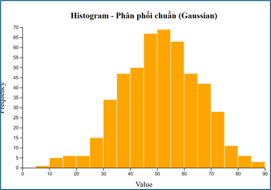
// ===== TẠO DỮ LIỆU PHÂN PHỐI CHUẨN =====
const randomNormal = d3.randomNormal(50, 15); // mean=50, std=15
const data = d3.range(500).map(() => randomNormal());
// ===== VẼ BIỂU ĐỒ=====
hist("#hist", data, {
bins: 25,
color: "orange",
title: "Histogram - Phân phối chuẩn (Gaussian)"
});
</script>Ví dụ histogram minh họa cách dùng D3.js để phân tích phân bố dữ liệu. Dữ liệu được chia thành các khoảng (bins), từ đó giúp người xem nhận biết xu hướng và mật độ phân bố.
Boxplot
<!DOCTYPE html>
<html>
<head>
<meta charset="utf-8">
<script src="https://d3js.org/d3.v7.min.js"></script>
</head>
<body>
<svg id="boxplot" width="700" height="450"></svg>
</body>
</html>
<script>
// ===== HÀM TÍNH CÁC THỐNG KÊ CHO BOXPLOT =====
function getBoxStats(data) {
const sorted = [...data].sort(d3.ascending);
const min = d3.min(sorted);
const max = d3.max(sorted);
const q1 = d3.quantile(sorted, 0.25);
const median = d3.quantile(sorted, 0.5);
const q3 = d3.quantile(sorted, 0.75);
const iqr = q3 - q1;
const lowerFence = q1 - 1.5 * iqr;
const upperFence = q3 + 1.5 * iqr;
const whiskerMin = d3.min(sorted.filter(d => d >= lowerFence));
const whiskerMax = d3.max(sorted.filter(d => d <= upperFence));
const outliers = sorted.filter(d => d < lowerFence || d > upperFence);
return {
min,
max,
q1,
median,
q3,
iqr,
whiskerMin,
whiskerMax,
outliers
};
}
// ===== HÀM VẼ BOXPLOT =====
function boxplot(selector, data, options = {}) {
const {
width = 700,
height = 450,
color = "steelblue",
title = "Boxplot",
xLabel = "Sample",
yLabel = "Value",
boxWidth = 120
} = options;
const margin = { top: 60, right: 40, bottom: 60, left: 70 };
const innerWidth = width - margin.left - margin.right;
const innerHeight = height - margin.top - margin.bottom;
const stats = getBoxStats(data);
const svg = d3.select(selector)
.attr("width", width)
.attr("height", height)
.html("")
.append("g")
.attr("transform", `translate(${margin.left}, ${margin.top})`);
// ===== SCALE =====
const y = d3.scaleLinear()
.domain([
d3.min([stats.min, ...stats.outliers]),
d3.max([stats.max, ...stats.outliers])
])
.nice()
.range([innerHeight, 0]);
const xCenter = innerWidth / 2;
// ===== TRỤC Y =====
svg.append("g")
.call(d3.axisLeft(y));
// ===== TRỤC X (chỉ 1 nhãn) =====
svg.append("line")
.attr("x1", xCenter - boxWidth)
.attr("x2", xCenter + boxWidth)
.attr("y1", innerHeight)
.attr("y2", innerHeight)
.attr("stroke", "black");
svg.append("text")
.attr("x", xCenter)
.attr("y", innerHeight + 25)
.attr("text-anchor", "middle")
.text(xLabel);
// ===== ĐƯỜNG WHISKER DỌC =====
svg.append("line")
.attr("x1", xCenter)
.attr("x2", xCenter)
.attr("y1", y(stats.whiskerMin))
.attr("y2", y(stats.whiskerMax))
.attr("stroke", "black")
.attr("stroke-width", 2);
// ===== HỘP (Q1 -> Q3) =====
svg.append("rect")
.attr("x", xCenter - boxWidth / 2)
.attr("y", y(stats.q3))
.attr("width", boxWidth)
.attr("height", y(stats.q1) - y(stats.q3))
.attr("fill", color)
.attr("opacity", 0.7)
.attr("stroke", "black");
// ===== ĐƯỜNG MEDIAN =====
svg.append("line")
.attr("x1", xCenter - boxWidth / 2)
.attr("x2", xCenter + boxWidth / 2)
.attr("y1", y(stats.median))
.attr("y2", y(stats.median))
.attr("stroke", "black")
.attr("stroke-width", 3);
// ===== NẮP WHISKER TRÊN =====
svg.append("line")
.attr("x1", xCenter - boxWidth / 3)
.attr("x2", xCenter + boxWidth / 3)
.attr("y1", y(stats.whiskerMax))
.attr("y2", y(stats.whiskerMax))
.attr("stroke", "black")
.attr("stroke-width", 2);
// ===== NẮP WHISKER DƯỚI =====
svg.append("line")
.attr("x1", xCenter - boxWidth / 3)
.attr("x2", xCenter + boxWidth / 3)
.attr("y1", y(stats.whiskerMin))
.attr("y2", y(stats.whiskerMin))
.attr("stroke", "black")
.attr("stroke-width", 2);
// ===== OUTLIERS =====
svg.selectAll(".outlier")
.data(stats.outliers)
.enter()
.append("circle")
.attr("cx", xCenter)
.attr("cy", d => y(d))
.attr("r", 4)
.attr("fill", "red")
.attr("opacity", 0.8);
// ===== TITLE =====
svg.append("text")
.attr("x", innerWidth / 2)
.attr("y", -25)
.attr("text-anchor", "middle")
.style("font-size", "18px")
.style("font-weight", "bold")
.text(title);
// ===== Y LABEL =====
svg.append("text")
.attr("transform", "rotate(-90)")
.attr("x", -innerHeight / 2)
.attr("y", -45)
.attr("text-anchor", "middle")
.text(yLabel);
}
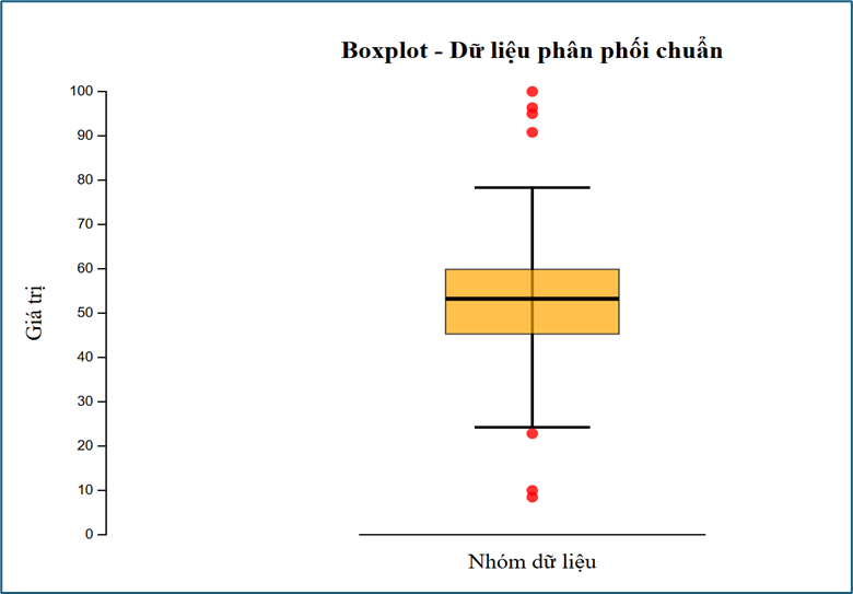
// ===== TẠO DỮ LIỆU PHÂN PHỐI CHUẨN =====
const randomNormal = d3.randomNormal(50, 12);
const data = d3.range(100).map(() => randomNormal());
// thêm vài ngoại lệ để boxplot thú vị hơn
data.push(10, 95, 100);
// ===== GỌI HÀM VẼ =====
boxplot("#boxplot", data, {
color: "orange",
title: "Boxplot - Dữ liệu phân phối chuẩn",
xLabel: "Nhóm dữ liệu",
yLabel: "Giá trị"
});
</script>Trong ví dụ này, chúng ta đã dùng D3.js để trực quan hóa các đặc trưng thống kê như median, quartile và outlier. Boxplot giúp tóm tắt dữ liệu một cách ngắn gọn nhưng rất hiệu quả.
Line chart
<!DOCTYPE html>
<html>
<head>
<meta charset="utf-8">
<script src="https://d3js.org/d3.v7.min.js"></script>
</head>
<body>
<svg id="line" width="700" height="400"></svg>
</body>
</html>
<script>
// ===== HÀM LINE CHART =====
function lineChart(selector, data, options = {}) {
const {
width = 700,
height = 400,
color = "steelblue",
title = "Line Chart",
xLabel = "X",
yLabel = "Y"
} = options;
const margin = { top: 50, right: 30, bottom: 50, left: 60 };
const innerWidth = width - margin.left - margin.right;
const innerHeight = height - margin.top - margin.bottom;
const svg = d3.select(selector)
.attr("width", width)
.attr("height", height)
.html("")
.append("g")
.attr("transform", `translate(${margin.left}, ${margin.top})`);
// ===== SCALE =====
const x = d3.scaleLinear()
.domain(d3.extent(data, d => d.x))
.range([0, innerWidth]);
const y = d3.scaleLinear()
.domain(d3.extent(data, d => d.y))
.nice()
.range([innerHeight, 0]);
// ===== LINE GENERATOR =====
const line = d3.line()
.x(d => x(d.x))
.y(d => y(d.y));
// ===== VẼ LINE =====
svg.append("path")
.datum(data)
.attr("fill", "none")
.attr("stroke", color)
.attr("stroke-width", 2)
.attr("d", line);
// ===== VẼ ĐIỂM =====
svg.selectAll("circle")
.data(data)
.enter()
.append("circle")
.attr("cx", d => x(d.x))
.attr("cy", d => y(d.y))
.attr("r", 3)
.attr("fill", color);
// ===== AXIS =====
svg.append("g")
.attr("transform", `translate(0, ${innerHeight})`)
.call(d3.axisBottom(x));
svg.append("g")
.call(d3.axisLeft(y));
// ===== TITLE =====
svg.append("text")
.attr("x", innerWidth / 2)
.attr("y", -20)
.attr("text-anchor", "middle")
.style("font-size", "18px")
.style("font-weight", "bold")
.text(title);
// ===== X LABEL =====
svg.append("text")
.attr("x", innerWidth / 2)
.attr("y", innerHeight + 40)
.attr("text-anchor", "middle")
.text(xLabel);
// ===== Y LABEL =====
svg.append("text")
.attr("transform", "rotate(-90)")
.attr("x", -innerHeight / 2)
.attr("y", -45)
.attr("text-anchor", "middle")
.text(yLabel);
}
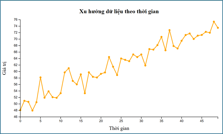
// ===== TẠO DỮ LIỆU =====
// Ví dụ: dữ liệu dạng chuỗi thời gian có nhiễu (noise)
const randomNormal = d3.randomNormal(0, 2);
const data = d3.range(50).map(i => ({
x: i,
y: 50 + i * 0.5 + randomNormal() // xu hướng tăng + nhiễu
}));
// ===== GỌI HÀM =====
lineChart("#line", data, {
title: "Xu hướng dữ liệu theo thời gian",
xLabel: "Thời gian",
yLabel: "Giá trị",
color: "orange"
});
</script>Ví dụ line chart cho thấy cách sử dụng D3.js để thể hiện xu hướng dữ liệu theo thời gian. Đường nối giữa các điểm giúp người xem dễ dàng nhận ra sự thay đổi và xu hướng.
Scatter plot
<!DOCTYPE html>
<html>
<head>
<meta charset="utf-8">
<script src="https://d3js.org/d3.v7.min.js"></script>
</head>
<body>
<svg id="scatter" width="700" height="400"></svg>
</body>
</html>
<script>
// ===== HÀM SCATTER =====
function scatterPlot(selector, data, options = {}) {
const {
width = 700,
height = 400,
color = "steelblue",
title = "Scatter Plot",
xLabel = "X",
yLabel = "Y"
} = options;
const margin = { top: 50, right: 30, bottom: 50, left: 60 };
const innerWidth = width - margin.left - margin.right;
const innerHeight = height - margin.top - margin.bottom;
const svg = d3.select(selector)
.attr("width", width)
.attr("height", height)
.html("")
.append("g")
.attr("transform", `translate(${margin.left}, ${margin.top})`);
// ===== SCALE =====
const x = d3.scaleLinear()
.domain(d3.extent(data, d => d.x))
.nice()
.range([0, innerWidth]);
const y = d3.scaleLinear()
.domain(d3.extent(data, d => d.y))
.nice()
.range([innerHeight, 0]);
// ===== VẼ ĐIỂM =====
svg.selectAll("circle")
.data(data)
.enter()
.append("circle")
.attr("cx", d => x(d.x))
.attr("cy", d => y(d.y))
.attr("r", 4)
.attr("fill", color)
.attr("opacity", 0.7);
// ===== AXIS =====
svg.append("g")
.attr("transform", `translate(0, ${innerHeight})`)
.call(d3.axisBottom(x));
svg.append("g")
.call(d3.axisLeft(y));
// ===== TITLE =====
svg.append("text")
.attr("x", innerWidth / 2)
.attr("y", -20)
.attr("text-anchor", "middle")
.style("font-size", "18px")
.style("font-weight", "bold")
.text(title);
// ===== X LABEL =====
svg.append("text")
.attr("x", innerWidth / 2)
.attr("y", innerHeight + 40)
.attr("text-anchor", "middle")
.text(xLabel);
// ===== Y LABEL =====
svg.append("text")
.attr("transform", "rotate(-90)")
.attr("x", -innerHeight / 2)
.attr("y", -45)
.attr("text-anchor", "middle")
.text(yLabel);
}
// ===== TẠO DỮ LIỆU =====
// dữ liệu có tương quan tuyến tính + nhiễu
const randomNoise = d3.randomNormal(0, 8);
const data = d3.range(100).map(() => {
const x = Math.random() * 100;
const y = 2 * x + randomNoise(); // y phụ thuộc x
return { x, y };
});
// ===== GỌI HÀM =====
scatterPlot("#scatter", data, {
title: "Scatter Plot - Tương quan giữa X và Y",
xLabel: "Biến X",
yLabel: "Biến Y",
color: "orange"
});
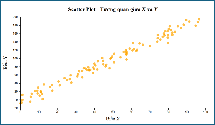
</script>Scatter plot thể hiện mối quan hệ giữa hai biến. Đây là dạng biểu đồ rất quan trọng trong phân tích dữ liệu và machine learning.
Tương tác với dữ liệu
Lọc dữ liệu theo năm
<!DOCTYPE html>
<html>
<head>
  <meta charset="utf-8">
  <script src="https://d3js.org/d3.v7.min.js"></script>
</head>
<body>

<h3>Lọc dữ liệu theo năm</h3>

<label for="yearSelect">Chọn năm:</label>
<select id="yearSelect">
  <option value="all">Tất cả</option>
  <option value="2024">2024</option>
  <option value="2025">2025</option>
  <option value="2026">2026</option>
</select>
<br><br>

<svg id="hist" width="700" height="450"></svg>

</body>
</html>

<script>
// ===== HÀM VẼ HISTOGRAM =====
function hist(selector, data, options = {}) {
  const {
    width = 700,
    height = 450,
    bins = 20,
    color = "steelblue",
    title = "Histogram",
    xLabel = "Value",
    yLabel = "Frequency"
  } = options;

  const margin = { top: 60, right: 30, bottom: 60, left: 60 };
  const innerWidth = width - margin.left - margin.right;
  const innerHeight = height - margin.top - margin.bottom;

  const svg = d3.select(selector)
    .attr("width", width)
    .attr("height", height)
    .html("")
    .append("g")
    .attr("transform", `translate(${margin.left}, ${margin.top})`);

  const x = d3.scaleLinear()
    .domain(d3.extent(data))
    .nice()
    .range([0, innerWidth]);

  const histogram = d3.bin()
    .domain(x.domain())
    .thresholds(x.ticks(bins));

  const binsData = histogram(data);

  const y = d3.scaleLinear()
    .domain([0, d3.max(binsData, d => d.length)])
    .nice()
    .range([innerHeight, 0]);

  svg.selectAll("rect")
    .data(binsData)
    .enter()
    .append("rect")
    .attr("x", d => x(d.x0))
    .attr("y", d => y(d.length))
    .attr("width", d => Math.max(0, x(d.x1) - x(d.x0) - 1))
    .attr("height", d => innerHeight - y(d.length))
    .attr("fill", color);

  svg.append("g")
    .attr("transform", `translate(0, ${innerHeight})`)
    .call(d3.axisBottom(x));

  svg.append("g")
    .call(d3.axisLeft(y));

  svg.append("text")
    .attr("x", innerWidth / 2)
    .attr("y", -25)
    .attr("text-anchor", "middle")
    .style("font-size", "18px")
    .style("font-weight", "bold")
    .text(title);

  svg.append("text")
    .attr("x", innerWidth / 2)
    .attr("y", innerHeight + 45)
    .attr("text-anchor", "middle")
    .text(xLabel);

  svg.append("text")
    .attr("transform", "rotate(-90)")
    .attr("x", -innerHeight / 2)
    .attr("y", -40)
    .attr("text-anchor", "middle")
    .text(yLabel);
}

// ===== TẠO DỮ LIỆU =====
const random2024 = d3.randomNormal(45, 10); // 2024: trung bình thấp hơn
const random2025 = d3.randomNormal(60, 12); // 2025: trung bình ở giữa
const random2026 = d3.randomNormal(75, 9); // 2026: trung bình cao hơn

const dataset = [];
// tạo 200 điểm mỗi năm
for (let i = 0; i < 200; i++) {
  dataset.push({ year: 2024, value: random2024() });
  dataset.push({ year: 2025, value: random2025() });
  dataset.push({ year: 2026, value: random2026() });
}

// ===== HÀM LỌC DỮ LIỆU THEO NĂM =====
function getFilteredData(year) {
  if (year === "all") {
    return dataset.map(d => d.value);
  }
  return dataset
    .filter(d => d.year === +year)
    .map(d => d.value);
}

// ===== HÀM CHỌN TIÊU ĐỀ THEO NĂM =====
function getTitle(year) {
  if (year === "all") {
    return "Histogram - Tất cả các năm";
  }
  return `Histogram - Dữ liệu năm ${year}`;
}

// ===== HÀM VẼ THEO NĂM ĐƯỢC CHỌN =====
function updateChart() {
  const selectedYear = document.getElementById("yearSelect").value;
  const filteredData = getFilteredData(selectedYear);

  hist("#hist", filteredData, {
    bins: 20,
    color: "orange",
    title: getTitle(selectedYear),
    xLabel: "Giá trị",
    yLabel: "Tần số"
  });
}

// ===== VẼ BAN ĐẦU =====
updateChart();

// ===== BẮT SỰ KIỆN KHI ĐỔI SELECT =====
document.getElementById("yearSelect").addEventListener("change", updateChart);
</script>
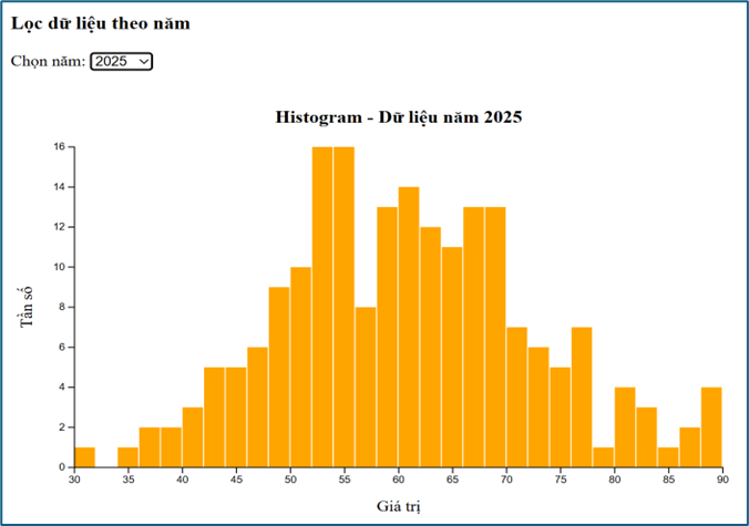
Ví dụ này cho thấy cách kết hợp với các thành phần giao diện HTML để lọc dữ liệu theo lựa chọn của người dùng. Biểu đồ được cập nhật lại mỗi khi dữ liệu thay đổi.
Pie chart có lọc dữ liệu
<!DOCTYPE html>
<html>
<head>
  <meta charset="utf-8">
  <script src="https://d3js.org/d3.v7.min.js"></script>

  <style>
    body { text-align: center; font-family: Arial; }
    h2 {  margin-bottom: 10px; }
    svg { display: block; margin: auto; }
    .btn-container { margin-top: 20px; }
    button {
      padding: 10px 20px; margin: 5px; font-size: 16px;
      border: none; border-radius: 5px;
      background-color: #4CAF50;
      color: white; cursor: pointer;
    }
    button:hover { background-color: #45a049; }
  </style>
</head>
<body>

<h2>Phân bố sản phẩm theo năm</h2>
<svg id="pie" width="500" height="400"></svg>

<div class="btn-container">
  <button onclick="updateChart('all')">Tất cả</button>
  <button onclick="updateChart('2024')">2024</button>
  <button onclick="updateChart('2025')">2025</button>
  <button onclick="updateChart('2026')">2026</button>
</div>

</body>
</html>

<script>
// ===== HÀM PIE =====
function pieChart(selector, data, title) {
  const width = 500;
  const height = 400;
  const radius = 150;

  const svg = d3.select(selector)
    .attr("width", width)
    .attr("height", height)
    .html("")
    .append("g")
    .attr("transform", "translate(250,200)");

  const color = d3.scaleOrdinal(d3.schemeCategory10);
  const pie = d3.pie().value(d => d.value);

  const arc = d3.arc()
    .innerRadius(0)
    .outerRadius(radius);

  const arcs = svg.selectAll("arc")
    .data(pie(data))
    .enter()
    .append("g");

  arcs.append("path")
    .attr("d", arc)
    .attr("fill", (d,i) => color(i));

  arcs.append("text")
    .attr("transform", d => "translate(" + arc.centroid(d) + ")")
    .attr("text-anchor", "middle")
    .style("font-size", "14px")
    .style("font-weight", "bold")
    .text(d => d.data.name);

  // ===== TITLE (to + căn giữa) =====
  d3.select(selector)
    .append("text")
    .attr("x", width / 2)
    .attr("y", 30)
    .attr("text-anchor", "middle")
    .style("font-size", "22px")
    .style("font-weight", "bold")
    .text(title);
}

// ===== DATA =====
const data2024 = [
  { name: "A", value: 30 },
  { name: "B", value: 50 },
  { name: "C", value: 20 }
];
const data2025 = [
  { name: "A", value: 40 },
  { name: "B", value: 35 },
  { name: "C", value: 25 }
];
const data2026 = [
  { name: "A", value: 20 },
  { name: "B", value: 30 },
  { name: "C", value: 50 }
];
const dataAll = [
  { name: "A", value: 30+40+20 },
  { name: "B", value: 50+35+30 },
  { name: "C", value: 20+25+50 }
];

// ===== UPDATE =====
function updateChart(year) {
  if (year === "2024") {
    pieChart("#pie", data2024, "Năm 2024");
  }
  else if (year === "2025") {
    pieChart("#pie", data2025, "Năm 2025");
  }
  else if (year === "2026") {
    pieChart("#pie", data2026, "Năm 2026");
  }
  else {
    pieChart("#pie", dataAll, "Tất cả các năm");
  }
}

// ===== BAN ĐẦU =====
updateChart("all");
</script>
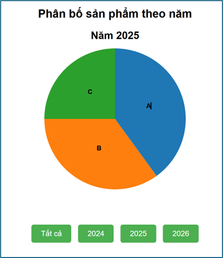
Ở đây, chúng ta sử dụng D3.js để cập nhật biểu đồ theo từng năm. Điều này minh họa rõ khả năng kết hợp giữa dữ liệu và tương tác trong môi trường web.
Tooltip và animation
<!DOCTYPE html>
<html>
<head>
  <meta charset="utf-8">
  <script src="https://d3js.org/d3.v7.min.js"></script>
  <style>
    body { text-align: center; font-family: Arial; }
    svg { display: block; margin: auto; }
    .btn-container { margin-top: 20px;}
    button {
      padding: 10px 20px; margin: 5px; font-size: 16px;
      border: none; border-radius: 5px;
      background-color: #4CAF50; color: white; cursor: pointer;
    }
    button:hover { background-color: #45a049; }
    #tooltip {
      position: absolute;  background: white;
      border: 1px solid gray;
      padding: 8px 12px;
      border-radius: 5px;
      font-size: 14px;
      pointer-events: none;
      display: none;
      box-shadow: 2px 2px 8px rgba(0,0,0,0.2);
    }
  </style>
</head>

<body>
<h2>Phân bố sản phẩm theo năm</h2>
<svg id="pie" width="500" height="400"></svg>

<div class="btn-container">
  <button onclick="updateChart('all')">Tất cả</button>
  <button onclick="updateChart('2024')">2024</button>
  <button onclick="updateChart('2025')">2025</button>
  <button onclick="updateChart('2026')">2026</button>
</div>

<div id="tooltip"></div>

</body>
</html>

<script>
// ===== HÀM PIE =====
function pieChart(selector, data, title) {
  const width = 500;
  const height = 400;
  const radius = 150;

  const svg = d3.select(selector)
    .attr("width", width)
    .attr("height", height)
    .html("");

  const g = svg.append("g")
    .attr("transform", "translate(250,200)");

  const color = d3.scaleOrdinal(d3.schemeCategory10);

  const pie = d3.pie()
    .value(d => d.value);

  const arc = d3.arc()
    .innerRadius(0)
    .outerRadius(radius);

  const arcs = g.selectAll("arc")
    .data(pie(data))
    .enter()
    .append("g");

  // ===== TOOLTIP =====
  const tooltip = d3.select("#tooltip");

  // ===== VẼ MIẾNG BÁNH + ANIMATION =====
  arcs.append("path")
    .attr("fill", (d, i) => color(i))
    .transition()
    .duration(800)
    .attrTween("d", function(d) {
      const interpolate = d3.interpolate(
        { startAngle: 0, endAngle: 0 },
        d
      );
      return function(t) {
        return arc(interpolate(t));
      };
    });

  // Vẽ lại path để gắn sự kiện tooltip
  arcs.append("path")
    .attr("d", arc)
    .attr("fill", (d, i) => color(i))
    .attr("opacity", 0)
    .on("mouseover", function(event, d) {
      tooltip
        .style("display", "block")
        .html("Nhóm: " + d.data.name + "<br>Giá trị: " + d.data.value);

      d3.select(this)
        .attr("stroke", "black")
        .attr("stroke-width", 2);
    })
    .on("mousemove", function(event) {
      tooltip
        .style("left", (event.pageX + 10) + "px")
        .style("top", (event.pageY - 10) + "px");
    })
    .on("mouseout", function() {
      tooltip.style("display", "none");

      d3.select(this)
        .attr("stroke", "none");
    });

  // ===== LABEL =====
  arcs.append("text")
    .attr("transform", d => "translate(" + arc.centroid(d) + ")")
    .attr("text-anchor", "middle")
    .style("font-size", "14px")
    .style("font-weight", "bold")
    .style("opacity", 0)
    .text(d => d.data.name)
    .transition()
    .delay(800)
    .duration(400)
    .style("opacity", 1);

  // ===== TITLE =====
  svg.append("text")
    .attr("x", width / 2)
    .attr("y", 30)
    .attr("text-anchor", "middle")
    .style("font-size", "22px")
    .style("font-weight", "bold")
    .text(title);
}

// ===== DATA =====
const data2024 = [
  { name: "A", value: 30 },
  { name: "B", value: 50 },
  { name: "C", value: 20 }
];

const data2025 = [
  { name: "A", value: 40 },
  { name: "B", value: 35 },
  { name: "C", value: 25 }
];

const data2026 = [
  { name: "A", value: 20 },
  { name: "B", value: 30 },
  { name: "C", value: 50 }
];

const dataAll = [
  { name: "A", value: 30 + 40 + 20 },
  { name: "B", value: 50 + 35 + 30 },
  { name: "C", value: 20 + 25 + 50 }
];

// ===== UPDATE =====
function updateChart(year) {
  if (year === "2024") {
    pieChart("#pie", data2024, "Năm 2024");
  }
  else if (year === "2025") {
    pieChart("#pie", data2025, "Năm 2025");
  }
  else if (year === "2026") {
    pieChart("#pie", data2026, "Năm 2026");
  }
  else {
    pieChart("#pie", dataAll, "Tất cả các năm");
  }
}

// ===== BAN ĐẦU =====
updateChart("all");
</script>
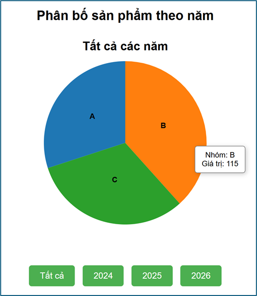
Ví dụ này thể hiện rõ sức mạnh của D3.js trong web: biểu đồ không chỉ hiển thị mà còn có thể chuyển động (animation) và hiển thị thông tin chi tiết (tooltip) theo thao tác của người dùng.
Sử dụng data binding
Data binding đơn giản

<!DOCTYPE html>
<html>
<head>
  <meta charset="utf-8">
  <script src="https://d3js.org/d3.v7.min.js"></script>

  <style>
    body { text-align: center; font-family: Arial; }
    button { padding: 8px 15px; margin: 5px; font-size: 14px; }
    p { font-size: 20px; margin: 5px; }
  </style>
</head>
<body>

<h2>Demo Data Binding</h2>

<button onclick="updateData(1)">Dữ liệu 1</button>
<button onclick="updateData(2)">Dữ liệu 2</button>
<button onclick="updateData(3)">Dữ liệu 3</button>

<div id="output"></div>

</body>
</html>

<script>
// ===== 3 BỘ DỮ LIỆU =====
const data1 = [10, 20, 30];
const data2 = [5, 15, 25, 35];
const data3 = [100, 200];

// ===== HÀM UPDATE =====
function updateData(type) {
  let data;
  if (type === 1) data = data1;
  else if (type === 2) data = data2;
  else data = data3;

  // ===== DATA BINDING =====
  d3.select("#output")
    .selectAll("p")
    .data(data)
    .join("p")
    .text(d => d);
}

// ===== BAN ĐẦU =====
updateData(1);

</script>
Ví dụ này minh họa cách dùng D3.js để gắn dữ liệu trực tiếp vào các phần tử HTML. Khi dữ liệu thay đổi, giao diện cũng thay đổi theo.
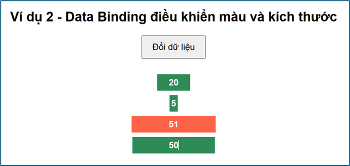
Data binding với màu và kích thước
<!DOCTYPE html>
<html>
<head>
  <meta charset="utf-8">
  <script src="https://d3js.org/d3.v7.min.js"></script>
  <style>
    body {
      font-family: Arial;
      text-align: center;
    }

    button {
      padding: 10px 18px;
      font-size: 16px;
      margin-bottom: 20px;
    }

    #box {
      width: 400px;
      margin: auto;
    }
  </style>
</head>
<body>

<h2>Ví dụ 2 - Data Binding điều khiển màu và kích thước</h2>

<button onclick="update()">Đổi dữ liệu</button>

<div id="box"></div>

<script>
let data = [10, 50, 80, 20];

function update() {
  data = data.map(() => Math.floor(Math.random() * 100));
  d3.select("#box")
    .selectAll("div")
    .data(data)
    .join("div")
    .style("width", d => d * 3 + "px")
    .style("height", "30px")
    .style("line-height", "30px")
    .style("margin", "8px auto")
    .style("color", "white")
    .style("font-weight", "bold")
    .style("background", d => d > 50 ? "tomato" : "seagreen")
    .text(d => d);
}

update();
</script>

</body>
</html>
Ở ví dụ này, chúng ta dùng D3.js để điều khiển giao diện dựa trên dữ liệu, như thay đổi màu sắc và kích thước theo giá trị.
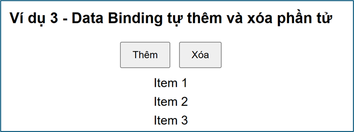
Data binding với việc thêm xóa các mục
<!DOCTYPE html>
<html>
<head>
  <meta charset="utf-8">
  <script src="https://d3js.org/d3.v7.min.js"></script>
  <style>
    body {
      font-family: Arial;
      text-align: center;
    }

    button {
      padding: 10px 18px;
      margin: 5px;
      font-size: 16px;
    }

    p {
      font-size: 20px;
      margin: 8px;
    }
  </style>
</head>
<body>

<h2>Ví dụ 3 - Data Binding tự thêm và xóa phần tử</h2>

<button onclick="addItem()">Thêm</button>
<button onclick="removeItem()">Xóa</button>

<div id="list"></div>

<script>
let data = [1, 2, 3];

function render() {
  d3.select("#list")
    .selectAll("p")
    .data(data)
    .join("p")
    .text(d => "Item " + d);
}

function addItem() {
  data.push(data.length + 1);
  render();
}

function removeItem() {
  if (data.length > 0) {
    data.pop();
    render();
  }
}

render();
</script>

</body>
</html>
Ví dụ cho thấy cách tự động thêm hoặc xóa phần tử khi dữ liệu thay đổi, giúp giao diện luôn đồng bộ với dữ liệu.
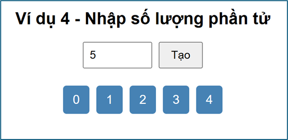
Data binding với số lượng các mục
<!DOCTYPE html>
<html>
<head>
  <meta charset="utf-8">
  <script src="https://d3js.org/d3.v7.min.js"></script>
  <style>
    body {
      font-family: Arial;
      text-align: center;
    }

    input {
      padding: 8px;
      font-size: 16px;
      width: 80px;
    }

    button {
      padding: 8px 16px;
      font-size: 16px;
      margin-left: 5px;
    }

    #output {
      margin-top: 20px;
    }

    span {
      display: inline-block;
      margin: 5px;
      padding: 10px 14px;
      background: steelblue;
      color: white;
      border-radius: 5px;
      font-size: 18px;
    }
  </style>
</head>
<body>

<h2>Ví dụ 4 - Nhập số lượng phần tử</h2>

<input type="number" id="n" value="5" min="0">
<button onclick="update()">Tạo</button>

<div id="output"></div>

<script>
function update() {
  const n = +document.getElementById("n").value;
  const data = d3.range(n);

  d3.select("#output")
    .selectAll("span")
    .data(data)
    .join("span")
    .text(d => d);
}

update();
</script>

</body>
</html>
Ví dụ này minh họa cách tạo giao diện linh hoạt theo số lượng dữ liệu đầu vào.
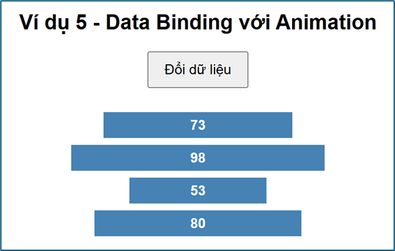
Data binding và animation
<!DOCTYPE html>
<html>
<head>
  <meta charset="utf-8">
  <script src="https://d3js.org/d3.v7.min.js"></script>
  <style>
    body {
      font-family: Arial;
      text-align: center;
    }

    button {
      padding: 10px 18px;
      font-size: 16px;
      margin-bottom: 20px;
    }

    #bars {
      width: 400px;
      margin: auto;
    }
  </style>
</head>
<body>

<h2>Ví dụ 5 - Data Binding với Animation</h2>

<button onclick="update()">Đổi dữ liệu</button>

<div id="bars"></div>

</body>
</html>

<script>
let data = [20, 40, 60, 80];

function update() {
  data = data.map(() => Math.floor(Math.random() * 100));

  d3.select("#bars")
    .selectAll("div")
    .data(data)
    .join("div")
    .transition()
    .duration(600)
    .style("width", d => d * 3 + "px")
    .style("height", "30px")
    .style("line-height", "30px")
    .style("margin", "8px auto")
    .style("background", "steelblue")
    .style("color", "white")
    .style("font-weight", "bold")
    .style("text-align", "center")
    .text(d => d);
}

update();
</script>
Data binding và sắp xếp dữ liệu
<!DOCTYPE html>
<html>
<head>
<meta charset="utf-8">
<script src="https://d3js.org/d3.v7.min.js"></script>
<style>
body {
font-family: Arial;
text-align: center;
}
button {
padding: 10px 18px;
margin: 5px;
font-size: 16px;
}
p {
font-size: 20px;
margin: 8px;
padding: 8px;
width: 120px;
margin-left: auto;
margin-right: auto;
background: #f2f2f2;
border-radius: 5px;
}
</style>
</head>
<body>
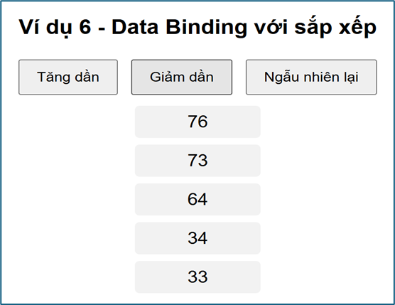
<h2>Ví dụ 6 - Data Binding với sắp xếp</h2>
<button onclick="sortAsc()">Tăng dần</button>
<button onclick="sortDesc()">Giảm dần</button>
<button onclick="randomData()">Ngẫu nhiên lại</button>
<div id="list"></div>
</body>
</html>
<script>
let data = [30, 10, 50, 20, 40];
function render() {
d3.select("#list")
.selectAll("p")
.data(data)
.join("p")
.text(d => d);
}
function sortAsc() {
data.sort((a, b) => a - b);
render();
}
function sortDesc() {
data.sort((a, b) => b - a);
render();
}
function randomData() {
data = d3.range(5).map(() => Math.floor(Math.random() * 100));
render();
}
render();
</script>Ví dụ này cho thấy cách sử dụng D3.js để thay đổi thứ tự hiển thị khi dữ liệu được sắp xếp lại.
Pie chart dùng data binding
<!DOCTYPE html>
<html>
<head>
  <meta charset="utf-8">
  <script src="https://d3js.org/d3.v7.min.js"></script>

  <style>
    body {
      text-align: center;
      font-family: Arial;
    }

    svg {
      display: block;
      margin: auto;
    }

    button {
      padding: 10px 20px;
      margin: 5px;
      font-size: 16px;
      border: none;
      border-radius: 5px;
      background-color: #4CAF50;
      color: white;
      cursor: pointer;
    }

    button:hover {
      background-color: #45a049;
    }
  </style>
</head>

<body>

<h2>Pie Chart - Data Binding</h2>

<svg id="pie" width="500" height="400"></svg>

<br>

<button onclick="updateChart('all')">Tất cả</button>
<button onclick="updateChart('2024')">2024</button>
<button onclick="updateChart('2025')">2025</button>
<button onclick="updateChart('2026')">2026</button>

</body>
</html>

<script>
// ===== DATA =====
const data2024 = [
  { name: "A", value: 30 },
  { name: "B", value: 50 },
  { name: "C", value: 20 }
];

const data2025 = [
  { name: "A", value: 40 },
  { name: "B", value: 35 },
  { name: "C", value: 25 }
];

const data2026 = [
  { name: "A", value: 20 },
  { name: "B", value: 30 },
  { name: "C", value: 50 }
];

const dataAll = [
  { name: "A", value: 30 + 40 + 20 },
  { name: "B", value: 50 + 35 + 30 },
  { name: "C", value: 20 + 25 + 50 }
];

// ===== SETUP SVG (CHỈ TẠO 1 LẦN) =====
const width = 500;
const height = 400;
const radius = 150;

const svg = d3.select("#pie")
  .attr("width", width)
  .attr("height", height);

const g = svg.append("g")
  .attr("transform", "translate(250,200)");

const color = d3.scaleOrdinal(d3.schemeCategory10);

const pie = d3.pie().value(d => d.value);

const arc = d3.arc()
  .innerRadius(0)
  .outerRadius(radius);

// ===== HÀM UPDATE =====
function updateChart(year) {

  let data;

  if (year === "2024") data = data2024;
  else if (year === "2025") data = data2025;
  else if (year === "2026") data = data2026;
  else data = dataAll;

  const arcs = pie(data);

  // ===== DATA BINDING =====
  const paths = g.selectAll("path")
    .data(arcs);

  // ===== ENTER + UPDATE + EXIT =====
  paths.join("path")
    .transition()
    .duration(500)
    .attr("d", arc)
    .attr("fill", (d, i) => color(i));

  // ===== LABEL =====
  const texts = g.selectAll("text")
    .data(arcs);

  texts.join("text")
    .transition()
    .duration(500)
    .attr("transform", d => "translate(" + arc.centroid(d) + ")")
    .attr("text-anchor", "middle")
    .style("font-size", "14px")
    .style("font-weight", "bold")
    .text(d => d.data.name);

  // ===== TITLE =====
  let title;
  if (year === "all") title = "Tất cả các năm";
  else title = "Năm " + year;

  svg.selectAll(".title")
    .data([title])
    .join("text")
    .attr("class", "title")
    .attr("x", width / 2)
    .attr("y", 30)
    .attr("text-anchor", "middle")
    .style("font-size", "20px")
    .style("font-weight", "bold")
    .text(d => d);
}

// ===== BAN ĐẦU =====
updateChart("all");

</script>
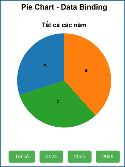
Đây là ví dụ nâng cao, minh họa cách sử dụng D3.js với cơ chế enter–update–exit để cập nhật biểu đồ một cách hiệu quả.
Kết luận
Sử dụng D3.js giúp xây dựng giao diện dữ liệu tương tác trên web. Từ bar chart, pie chart, line chart đến scatter plot. Bạn có thể dễ dàng thêm lọc dữ liệu, tooltip, animation và data binding.
Điểm mạnh lớn nhất của D3.js là khả năng tích hợp sâu vào web. Biểu đồ trở nên sinh động, linh hoạt và phản hồi ngay với hành động của người dùng.
Thực hành qua các ví dụ giúp bạn tư duy kết hợp giữa dữ liệu, giao diện và tương tác. Đây chính là nền tảng quan trọng để phát triển dashboard và ứng dụng trực quan hóa hiện đại.


